Overview
All WebAwesome components
Avatar
Avatars are used to show a thumbnail representation of an individual or business.
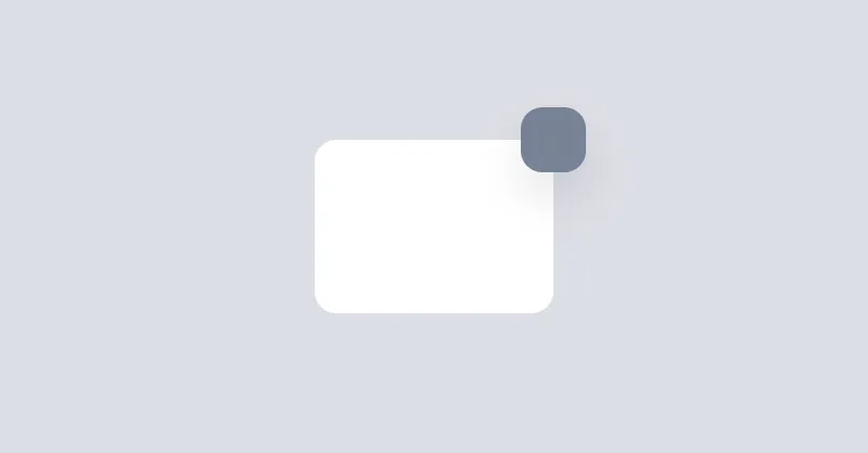
Badge
Badges are used to place an element on the corner of another element.
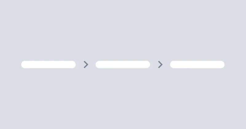
Breadcrumbs
Breadcrumbs helps users to navigate through the website.
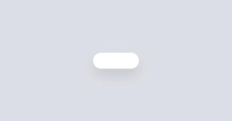
Button
Buttons allow the user to take actions or make choices.

Callout
Callout is used to display important messages inline.
Checkbox
Checkboxes are used to select or deselect a value.
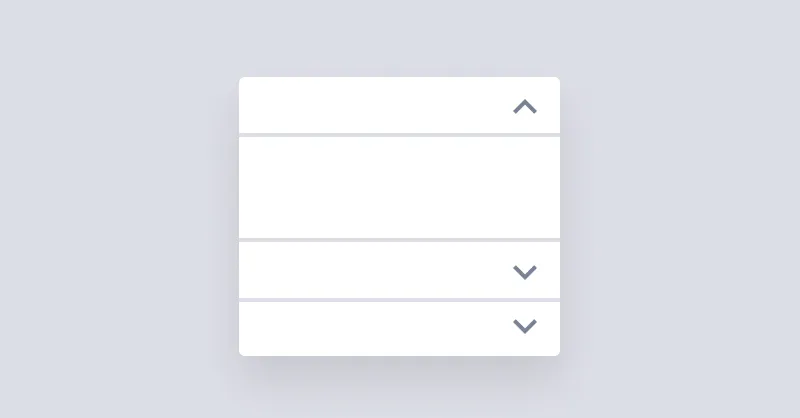
Details
Details show a brief summary and expand to show additional content.
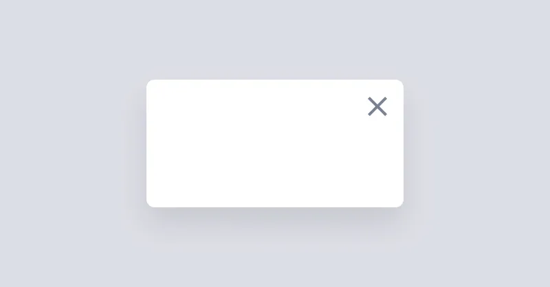
Dialog
Dialogs, sometimes called "modals", appear above the page and require the user's immediate attention.
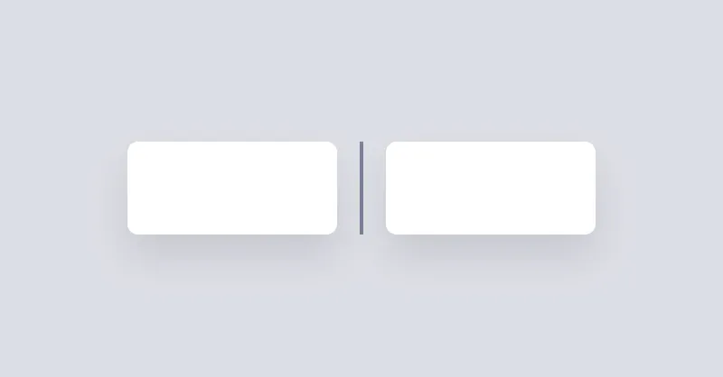
Divider
Divider will be used to separate content vertically or horizontally.

Drawer
Drawer is a grid layout that can show/hide a sidebar on the left or right side of the page.
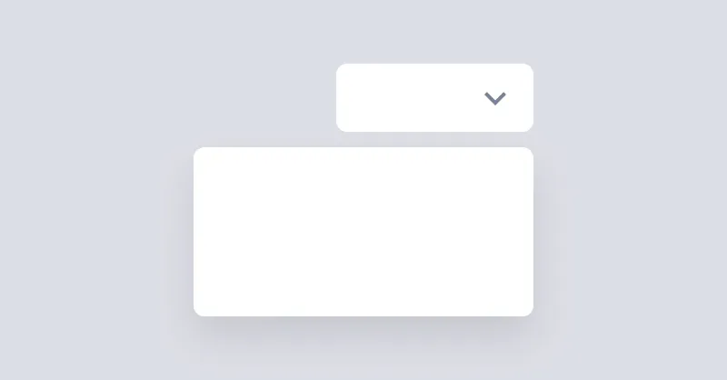
Dropdown
Dropdown can open a menu or any other element when the button is clicked.

Icon
Icons are a great way to represent an idea or action.
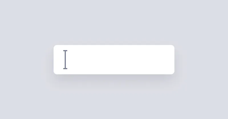
Input
Text Input is a simple input field.
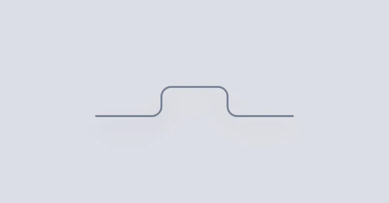
Popover
Popover can be used to show a message when hovering over an element.

Radio Group
Radio groups are used to group multiple radios so they function as a single form control.
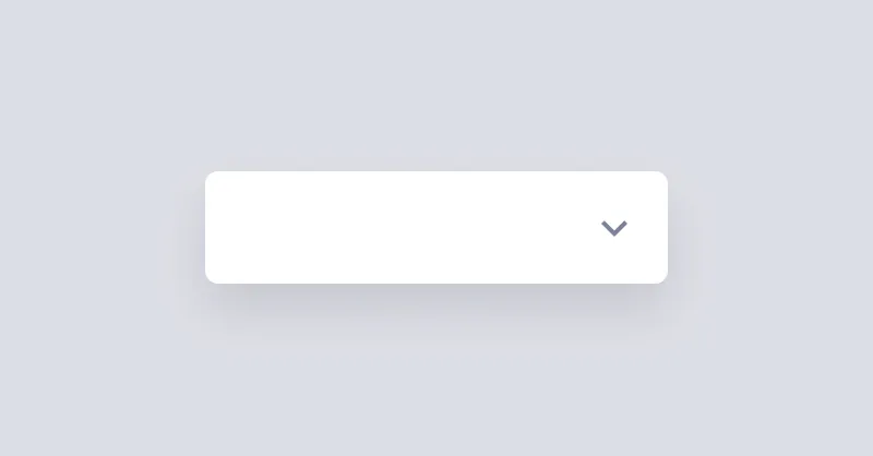
Select
Select is used to pick a value from a list of options.
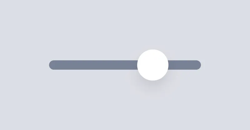
Slider
Range slider is used to select a value by sliding a handle.
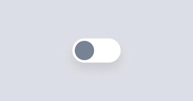
Switch
Switches allow the user to toggle an option on or off.
Tab
Tab can be used to show a list of links in a tabbed format.
Tag
Tags are used to inform the user of the status of specific data.
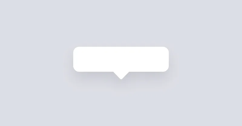
Tooltip
Tooltip can be used to show a message when hovering over an element.