Overview
All Laminar components
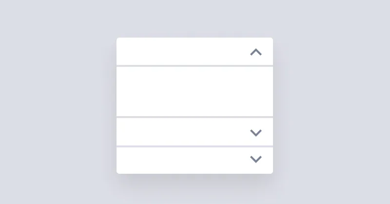
Accordion
Accordion is used for showing and hiding content but only one item can stay open at a time.
Avatar
Avatars are used to show a thumbnail representation of an individual or business.
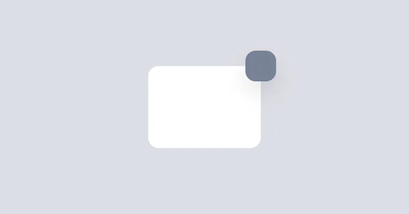
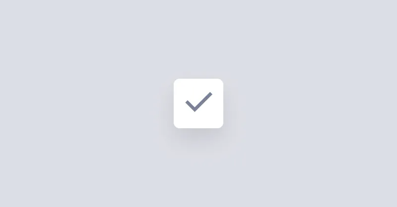
Badge
Badges are used to place an element on the corner of another element.
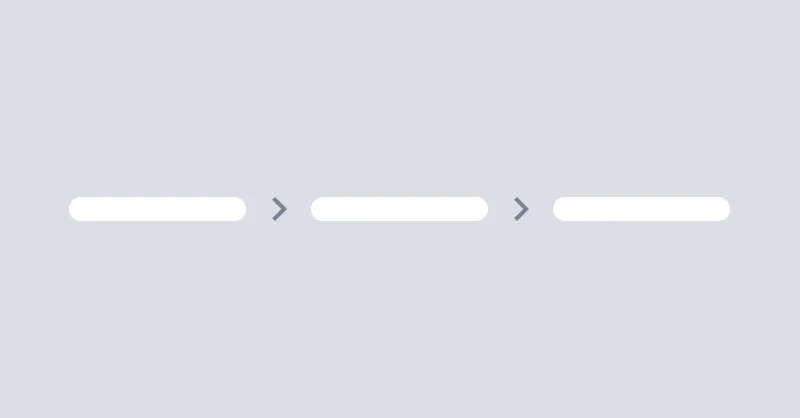
Breadcrumbs
Breadcrumbs helps users to navigate through the website.
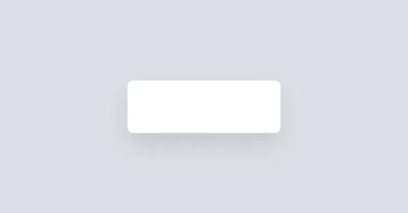
Button
Buttons allow the user to take actions or make choices.

Callout
Callout is used to display important messages inline.
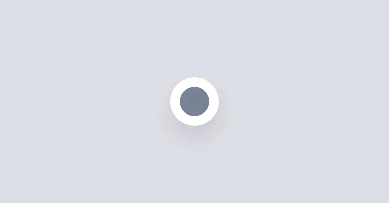
Checkbox
Checkboxes are used to select or deselect a value.
Collapse
Collapse is used for showing and hiding content.
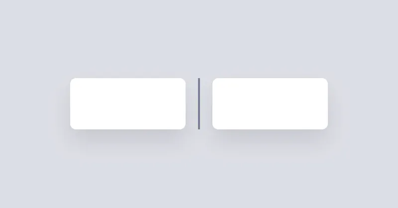
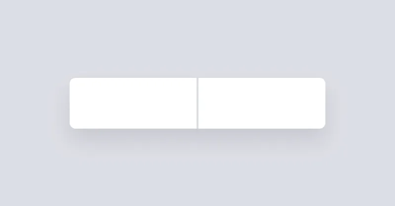
Divider
Divider will be used to separate content vertically or horizontally.
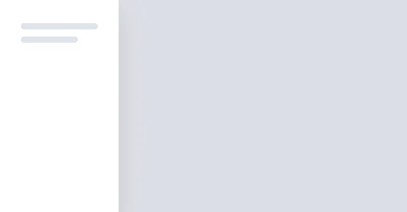
Drawer
Drawer is a grid layout that can show/hide a sidebar on the left or right side of the page.
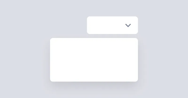
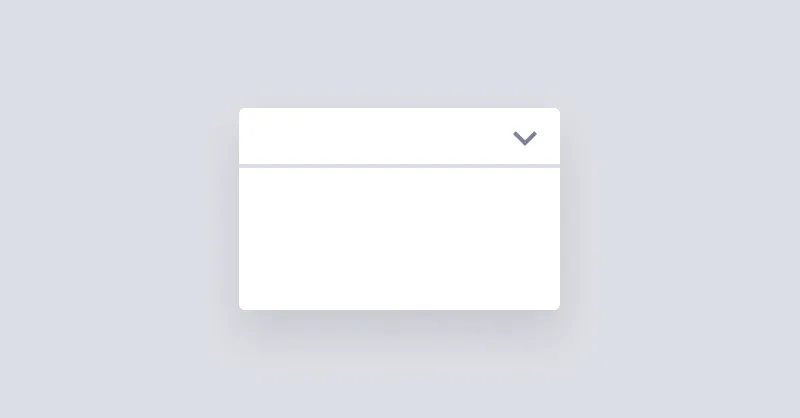
Dropdown
Dropdown can open a menu or any other element when the button is clicked.

Icon
Icons are a great way to represent an idea or action.
Menu
Menu is used to display a list of links vertically or horizontally.
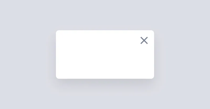
Modal
Modal is used to show a dialog or a box when you click a button.
Non Ideal State
A Non-Ideal State represents situations where content isn't available.
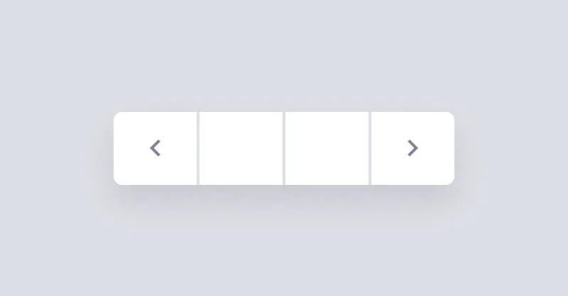
Pagination
Pagination is a group of buttons that allow the user to navigate between a set of related content.
Popover
Popover displays interactive content when its anchor element is clicked.
Radio Group
Radio groups are used to group multiple radios so they function as a single form control.
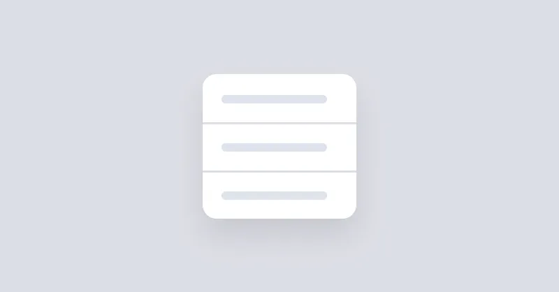
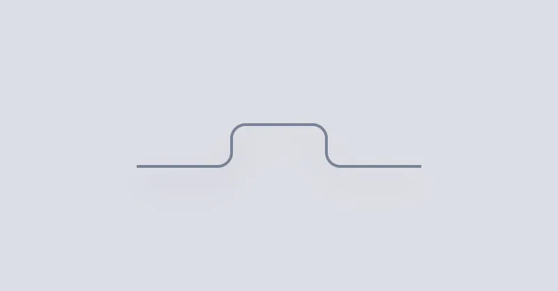
Segment
Segments are used to group related content together.
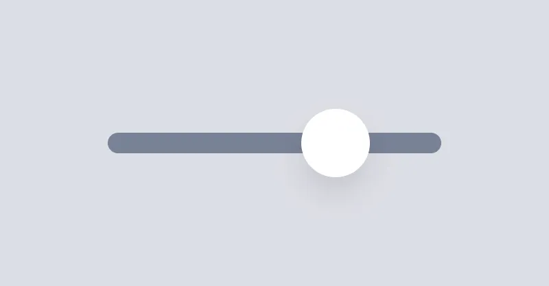
Slider
Ranges allow the user to select a single value within a given range using a slider.
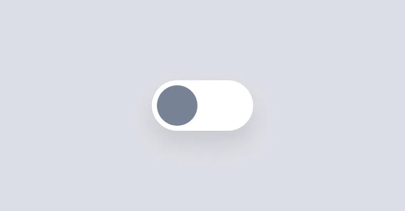
Switcher
Switcher is a checkbox that is styled to look like a switch button.
Tab
Tab can be used to show a list of links in a tabbed format.
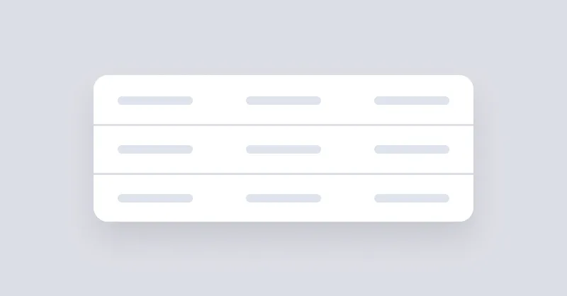
Table
Table can be used to show a list of data in a table format.
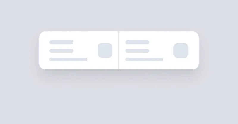
Tag
Tags are used to inform the user of the status of specific data.
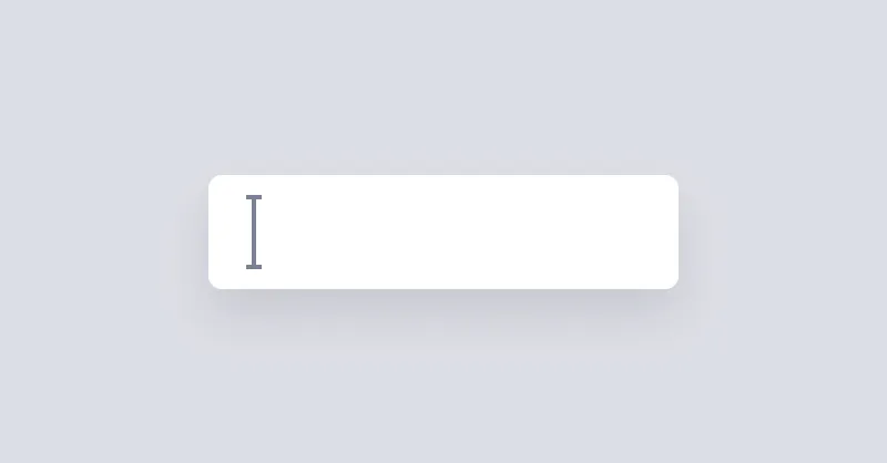
Textbox
Inputs collect data from the user.

Toast
Toast is a wrapper to stack elements, positioned on the corner of page.
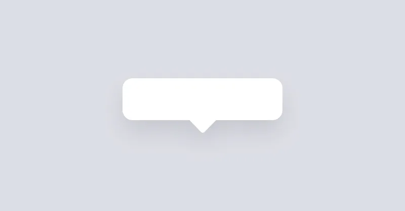
Tooltip
Tooltip can be used to show a message when hovering over an element.